Next up in our feature titled 'Book Lovers Favourite Book Covers' is book designer and publisher Michael Russem, who heads up Kat Ran Press. We're huge admirers of his publishing house, so we were delighted he agreed to share with us his favourite book cover and to discuss what makes it so special for him.
"When I was a kid, my dad’s friend taught me how to play chess. I suspect he only taught me so he would have someone to beat via Scholar’s Mate, which allows a player to declare checkmate in four moves. Gracefully efficient, it’s a sort of chess parlor trick. However, it has stayed with me since I was eight or nine, and I think of it often when I’m at work: How can I design a useful and handsome book in as few moves as possible?
As I’m a typographer, the covers that make my heart swell with both admiration and envy declare checkmate as soon as I see them, and they tend to be purely typographic (or calligraphic). Give me some clear letters jammed in the upper left corner, or centered and spaced with excruciating care, and I’ve got all I need—and so does a reader.
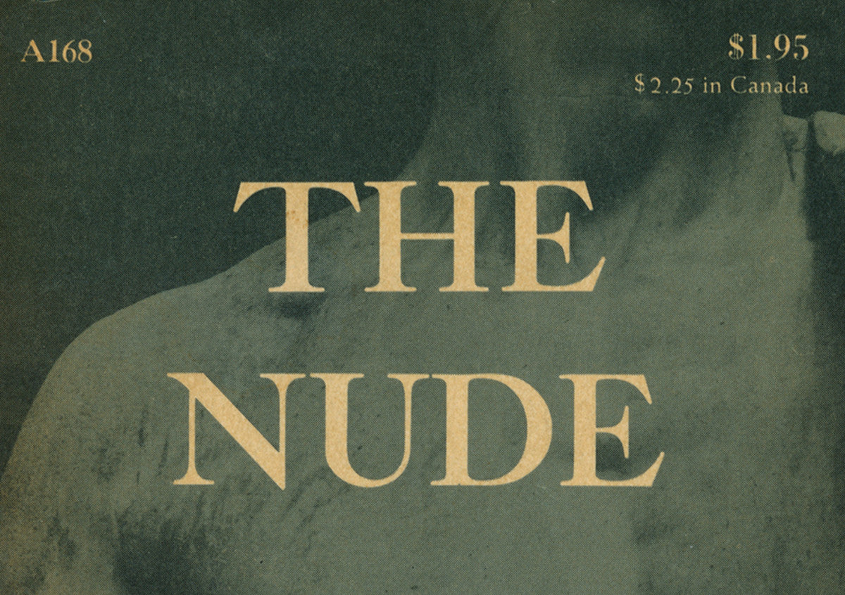
But as a weekend design scholar, I also love covers that surprise me for how they don’t quite fit into what I think of as a designer’s regular body of work. Leonard Baskin’s design for Kenneth Clark’s The Nude (Doubleday Anchor, 1956) is a perfect example of this. At that stage in his career, Baskin (1922–2000) had not yet reached his mature typographic style, which would rely heavily on Bembo and Centaur types, display lines of rarely-spaced roman or italic caps, red rules and ornaments, and text blocks tucked deep into the gutters. Typically, his illustrations and texts were each kept in their own place, and it’s rare to see him feature a photograph. But here in The Nude we see type on a photograph of Michelangelo’s David, cropped tightly to the torso. This brings a different sort of immediacy we don’t typically see in Baskin’s prints, which usually show figures (no matter how conflicted or tortured) in their entirety or at least a step or two back—and always with a head. It’s a surprisingly modern cover from someone who took so much inspiration from Renaissance artists and printers.
Is this a great cover? Probably not. But it surprised me—and sometimes that’s good enough to make a cover a favorite."
Michael Russem
The Offices of Kat Ran Press
Book Lovers Favourite Covers – Michael Russem
It is a simple but elegantly ordered composition where each successive line of type is one half the previous. Massimo Vignelli would have approved.
Jeremy Botts on