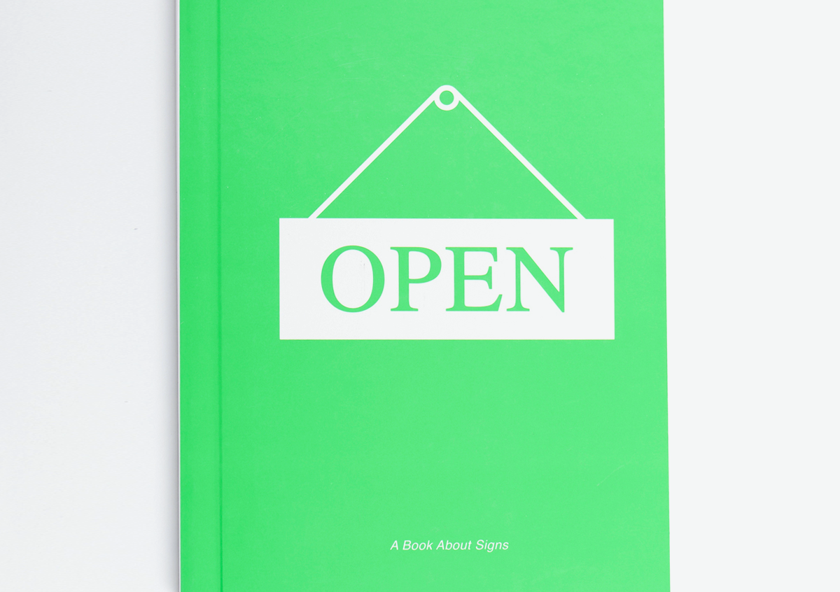
We thought we'd touch base with the illustrator behind one of our current favourite books, Russell Weekes. A few weeks ago we received a new book through the door titled 'A Book About Signs', which we have been obsessing over ever since. We see a lot of books, as you can imagine, but something about this one felt a little special, so we thought we'd delve a little deeper.
The book, published by Cicada, is a whimsical look at the signs that surround us and how different signs communicate in different ways. Here's the lowdown on how the project came about and Russell's love of the humble sign.
J_Can you tell me about how the concept of the book came about? R_The idea for the book came from the publisher Ziggy Hanaor at Cicada books. She had found a beautiful 1970s children's book about signage. As so much had changed since this book was published, she thought it could be interesting to look at this subject based on the signs we are now surrounded by.
Ziggy approached me with the idea and I was really interested in what we could do.
J_How did you research the project, had you been collecting photos for a while, sketch books etc? R_There was a fair amount of image research and photo taking, but this was mainly done once the ideas had been developed. Initially I began with lists, noting down the various types of signage and what we could say about them.
I was keen to try and find ways to talk about signage that was not only visual, instead looking at the places we find them, unique uses, the materials and construction and any other details that the viewer might not already know. Design was obviously still a key part, but one of the great things about signage design is that function is a priority, and function relies on many different factors.
In selecting the signs to feature in the book, we wanted to get as wide a spectrum as possible, while aiming for the majority to be easily found within everyday life.
We wanted the book to be approachable and fun, but being educational was important to us as this is a key part of the book's function. The aim was to make the viewer look at the seemingly mundane in more detail.
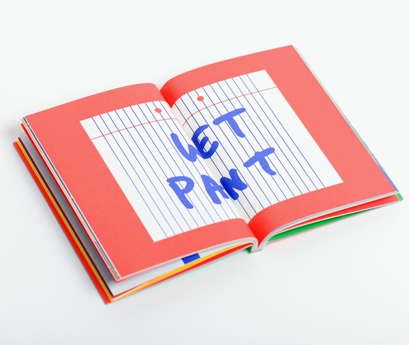
J_Were there any unexpected challenges in compiling the book? R_Personally, a big challenge was developing a tone and look that felt consistent throughout the book. At the start of the project I worked on developing a set of limitations for the design and illustration. These included; limiting the printing colours to 4 in total and no more than 2 colours per illustration, an illustration style that showed enough information without becoming fussy, the choice to avoid showing people within the book, a point of view that was generally close-up and the idea to focus on one sign per page rather than showing scenes.
These limitations helped to keep the book consistent, but also helped me to make visual and conceptual decisions quicker, as I had set the parameters of what was possible.
Another challenge was to get the right tone of voice for the writing. The written information is important as it highlights key details and gives context to the illustrations. Initially I found it hard to simplify the information into bite sized pieces, but again for consistency a word limit was put in place that controlled this.
J_How long did it take you to illustrate all the signs? R_The project was done over the course of about 6 months. As we had set limitations, the decision making process became quicker as the project went on. Once the visual style was developed, any new pages had to conform to this. The problem at times was that some ideas proved difficult to simplify into the chosen look, and as a result they took longer to get right.
J_Do you have a favourite sign? R_I think my favourite spread might be the house one, with the blue plaque on one page and the 'For Sale' sign on the other. I like that on one hand these signs are connected through being house related, but the writing focuses on functionality, which is where they are very different. One is made to be long lasting, while the other has a very short lifespan, and as a result the materials they are made from are very different.
It became interesting to make these kind of observations within the book. On the one hand we feature the location and design, while on the other, we are able to highlight the function, purpose and manufacturing. In many forms of signage these two aspects, design and function, must be connected.
J_Were there many signs that you had to leave out of the book? R_No not really, there were a few on the lists that didn't make it into the book, but they were ruled out pretty easily, usually for being too similar to another signs in the book or being a bit obscure.
There are a few more abstract 'signs' in the book such as how butterfly wings mimic eyes, which we felt were an interesting addition as like most signs, they communicate a clear message to an intended audience. The aim is to encourage the viewer to think about the way they look at the work.
J_What do you hope a younger reader will gain from the book? R_I'd hope that the book makes a younger reader look more closely at the everyday environment in which they live. Not just signage, though that is the focus of this book, but hopefully to look at the way things work, the way they are designed with a purpose in mind and perhaps to question things that they might take for granted.
Nowadays, we are bombarded with signage of all kinds and it is easy to take in messages without really seeing or thinking about them.
A key part of signage design is simplification, how we get a message across as simply and clearly as possible. I think this is something that children often do really well, by focusing on the detail rather than getting lost in the bigger picture. This is a subject that really interests me and hopefully the book encourages it, especially through the activity pages where the reader has to design certain signs themselves.
J_Do you have any further plans for published works? R_Yes, publishing as a means to distribute ideas affordably is something I am increasingly interested in. The idea of looking in more detail at our everyday environment is something I also hope to continue exploring, in an attempt to promote alternative ways to look at the seemingly mundane, both for children and adults.
Russell Weekes
www.eekes.com


The book, published by Cicada, is a whimsical look at the signs that surround us and how different signs communicate in different ways. Here's the lowdown on how the project came about and Russell's love of the humble sign.
J_Can you tell me about how the concept of the book came about? R_The idea for the book came from the publisher Ziggy Hanaor at Cicada books. She had found a beautiful 1970s children's book about signage. As so much had changed since this book was published, she thought it could be interesting to look at this subject based on the signs we are now surrounded by.
Ziggy approached me with the idea and I was really interested in what we could do.
J_How did you research the project, had you been collecting photos for a while, sketch books etc? R_There was a fair amount of image research and photo taking, but this was mainly done once the ideas had been developed. Initially I began with lists, noting down the various types of signage and what we could say about them.
I was keen to try and find ways to talk about signage that was not only visual, instead looking at the places we find them, unique uses, the materials and construction and any other details that the viewer might not already know. Design was obviously still a key part, but one of the great things about signage design is that function is a priority, and function relies on many different factors.
In selecting the signs to feature in the book, we wanted to get as wide a spectrum as possible, while aiming for the majority to be easily found within everyday life.
We wanted the book to be approachable and fun, but being educational was important to us as this is a key part of the book's function. The aim was to make the viewer look at the seemingly mundane in more detail.
J_Were there any unexpected challenges in compiling the book? R_Personally, a big challenge was developing a tone and look that felt consistent throughout the book. At the start of the project I worked on developing a set of limitations for the design and illustration. These included; limiting the printing colours to 4 in total and no more than 2 colours per illustration, an illustration style that showed enough information without becoming fussy, the choice to avoid showing people within the book, a point of view that was generally close-up and the idea to focus on one sign per page rather than showing scenes.
These limitations helped to keep the book consistent, but also helped me to make visual and conceptual decisions quicker, as I had set the parameters of what was possible.
Another challenge was to get the right tone of voice for the writing. The written information is important as it highlights key details and gives context to the illustrations. Initially I found it hard to simplify the information into bite sized pieces, but again for consistency a word limit was put in place that controlled this.
J_How long did it take you to illustrate all the signs? R_The project was done over the course of about 6 months. As we had set limitations, the decision making process became quicker as the project went on. Once the visual style was developed, any new pages had to conform to this. The problem at times was that some ideas proved difficult to simplify into the chosen look, and as a result they took longer to get right.
J_Do you have a favourite sign? R_I think my favourite spread might be the house one, with the blue plaque on one page and the 'For Sale' sign on the other. I like that on one hand these signs are connected through being house related, but the writing focuses on functionality, which is where they are very different. One is made to be long lasting, while the other has a very short lifespan, and as a result the materials they are made from are very different.
It became interesting to make these kind of observations within the book. On the one hand we feature the location and design, while on the other, we are able to highlight the function, purpose and manufacturing. In many forms of signage these two aspects, design and function, must be connected.
J_Were there many signs that you had to leave out of the book? R_No not really, there were a few on the lists that didn't make it into the book, but they were ruled out pretty easily, usually for being too similar to another signs in the book or being a bit obscure.
There are a few more abstract 'signs' in the book such as how butterfly wings mimic eyes, which we felt were an interesting addition as like most signs, they communicate a clear message to an intended audience. The aim is to encourage the viewer to think about the way they look at the work.
J_What do you hope a younger reader will gain from the book? R_I'd hope that the book makes a younger reader look more closely at the everyday environment in which they live. Not just signage, though that is the focus of this book, but hopefully to look at the way things work, the way they are designed with a purpose in mind and perhaps to question things that they might take for granted.
Nowadays, we are bombarded with signage of all kinds and it is easy to take in messages without really seeing or thinking about them.
A key part of signage design is simplification, how we get a message across as simply and clearly as possible. I think this is something that children often do really well, by focusing on the detail rather than getting lost in the bigger picture. This is a subject that really interests me and hopefully the book encourages it, especially through the activity pages where the reader has to design certain signs themselves.
J_Do you have any further plans for published works? R_Yes, publishing as a means to distribute ideas affordably is something I am increasingly interested in. The idea of looking in more detail at our everyday environment is something I also hope to continue exploring, in an attempt to promote alternative ways to look at the seemingly mundane, both for children and adults.
Russell Weekes
www.eekes.com


